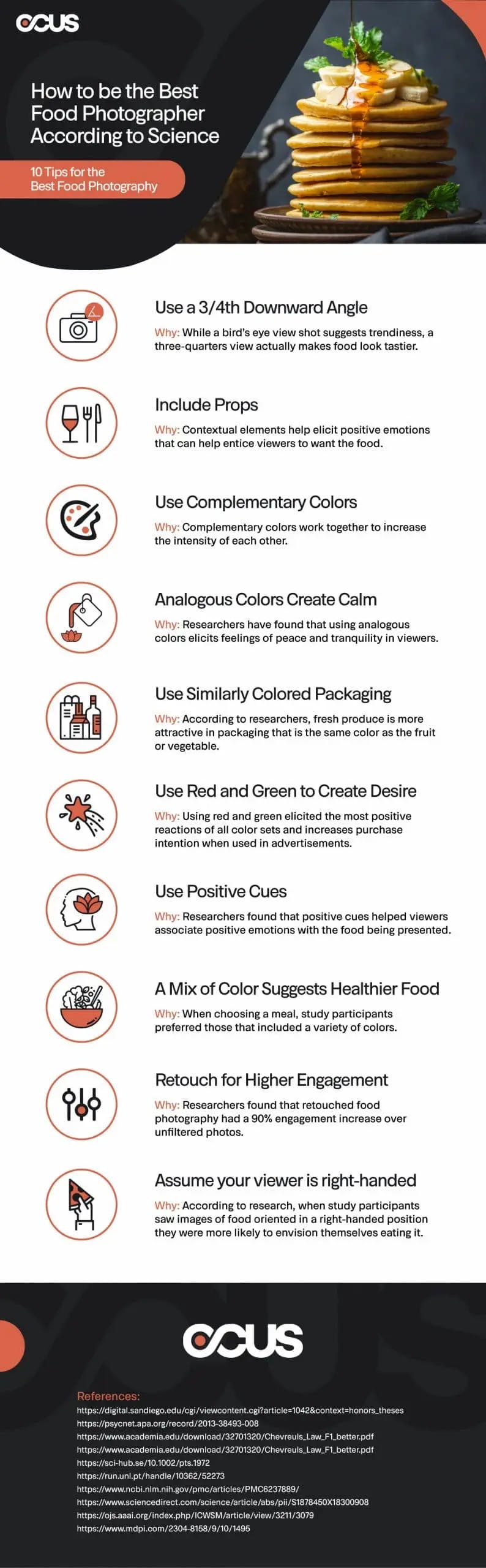
10 Tips for the Best Food Photography Backed By Science + Infographic
Food photography is not just about crafting an aesthetically pleasing image, but about igniting a craving in the observer. Achieving this impact demands an understanding of various elements that influence perception. Beyond artistic flair, these aspects delve into human sensory response, a subject extensively researched by scientists. In this blog, we'll explore their findings and how they can elevate your food photography.
Food photography may seem to be more art than science – after all, it’s about producing a picture that looks good and elicits a specific reaction in the viewer: making them want to eat. However, maximizing that response requires a basic knowledge of the various factors that affect how the viewer sees the picture.
Some of those factors extend past the world of art and delve deeper into the way the viewer perceives the stimuli of the image. Thankfully, this is something that the people who wear lab coats have put a whole lot of effort into researching. Today we’re going to discuss what they’ve discovered and how it can help you create the best photos of food.
1. The angle of your shot matters
Let’s start with something basic: shot angles. Every photographer knows how to get the best possible angle for their shot, but what exactly that means in the case of food may not be so clear.
One researcher at the University of San Diego decided to experiment with two possible angles: a “birds-eye view” from straight overhead and “a three-quarter downward-looking angle (as if you were sitting at the table ready to take a bite of the food)”.
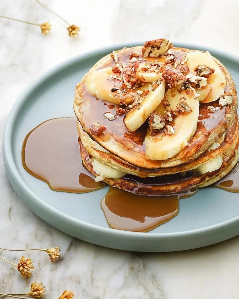
The finding? While the birds-eye view suggests you have a trendy brand, the three-quarters angle view made the food look tastier to people. What this truly boils down to, is that the angle of the photograph has a psychological effect on the viewer.
Consider this question when taking your photos: what is your goal? If you want to sell food, a three-quarter angle may be your best choice, but if your goal is to sell the brand then consider a higher angle. When deciding which of the multitude of camera angles your photography should use keeping your marketing goals in mind will only strengthen the overall results.
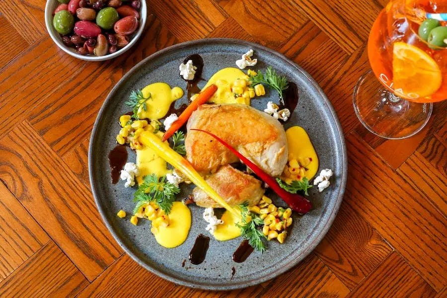
2. Don’t just include the food
Food may be the focus of your photoshoot but you should resist the temptation to remove everything from the environment, at least that’s what researchers have found. One study showed that when a photo shows a person eating unhealthy food, not only will the viewer feel less bad about eating unhealthily, but the food will taste even better.
So what does this mean for you, the food photographer? When trying to sell food that’s high-calorie like baked goods and desserts, you should try your best to include an image of a person enjoying the food. While this may not always be a feasible option, it can be good to remember this tip.
Having only food in the photos you take does have its purpose, but you should also remember the importance of contextual clues. If seeing a person eating unhealthy food alleviates guilt and improves the taste of the actual food, creating scenes with elements that elicit a positive response will also improve the impact of the photograph that you take.
When you include elements that elicit positive triggers you can further entice the viewer. Some elements that can evoke a positive response are things like clean spaces, lighting, colors, and even the utensils used to create the food.
These details make it easier for the viewer to picture themselves in the situation that you’ve created with the photograph. This will help your client to sell more dishes and will help you to become more successful as a food photographer.
Sometimes small changes in the context of an image can change the overall feel of the image. An example of this would be to picture a table, holding a platter with a roast turkey. If the image only had the platter and turkey, it would elicit a different response than the same platter and turkey alongside multiple place settings, a bowl of stuffing, gravy boats, and table decor in the colors associated with the American holiday of Thanksgiving.
Remember that contextual clues in photography, especially food photography, are just as important as they are in literature or film.
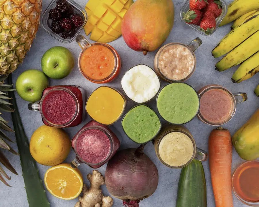
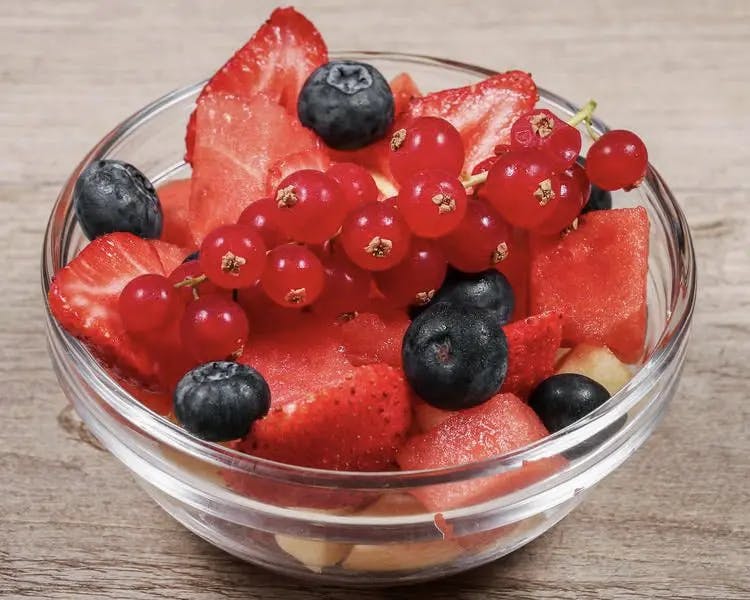
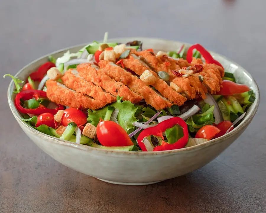
3. Use complementary colors
Moving on from contextual clues, let us discuss color. You are likely already familiar with the color wheel and how colors that are on opposite sides of the color wheel complement each other. For example, colors like red and green or blue and orange are said to be complementary.
Frequently, in advertising, these colors are used to attract the attention of a viewer. More importantly, according to science, when these colors are placed next to each other they become more intense. If you place a red-colored food item next to a green item, the red appears redder and the green becomes greener.
To execute this principle, you can try some simple things. For example, if you’re taking photographs of red apples, you may want to place those apples on a green background. This will help the apples appear redder which will give the viewer the perception that the apples are fresher and tastier without having to have eaten them.
Another thing you can do is when taking a photograph of a salad, make sure that the tomatoes or radishes (or other red vegetables) are prominently displayed within the food so that they can maximize the impact of the green leafy vegetables. These simple actions will deepen the visual interest of the photograph with minimal additional effort. It will not only sharpen the image but will also make mouths water.
4. Use analogous colors
Back to the color wheel. Analogous colors are the colors on a color wheel that are next to each other. While complementary colors may create bold contrasts and deepen the intensity of the color, analogous colors offer viewers a more calm and subdued look and are often easier on the senses.
Typically, complementary colors are in pairs of two, while analogous colors are in sets of three. Make use of these colors when you want to create a mood of peace and tranquility in the photograph. Whilst none of the food in an analogous presentation will explicitly stand out, neither is there a risk of attention being elsewhere.
It is up to you to determine if this strategy will be effective for creating the best food photography. For some restaurants, it may not fit well with their brand to use analogous colors for their food photography. However, this tip can help with overall restaurant branding.
You can combine this tip with the last by composing your background with analogous colors and using complementary colors to highlight the food. Additionally, this concept could be seen with an image where everything in the background is three shades of a color (chosen for the psychological response), and the food item is in the photograph in its “normal” coloration, thus standing out from the crowd.
5. Consider the packaging
So you are all set to focus on using complementary colors in your next food photography project? Well, before you use complementary colors to create your food photographs, you need to consider the packaging of the food.
Did you know that a complementary color scheme will not be as effective if food is in a mesh package? Specifically, one study suggests that fresh produce is more attractive in a mesh package that is the same color than in one which is a complimentary color.
Generally speaking, for the best food photography you’ll want to take photos of food unpackaged and prepared. However, in many cases, if you are looking to create a raw, rustic, or down-to-earth look, you may want to present the food unprepared. In this case, particularly when working with produce companies, you’ll want to present the food raw and unprepared. You may even be better off showing the food in their packaging or bundled.
In these circumstances, you’ll want to carefully consider the packaging of the food. So, while stewed tomatoes will look best on a green plate or bowl, freshly picked tomatoes will look better if they are presented in a red bag or bowl.
Make sure to keep this concept in mind as you plan out your shots. It will help you to create the best food photography in the business. Keeping this in mind along with the other tips will help you present the brand without negatively impacting the way the viewer perceives the food.
6. Create desire with red and green
If you do not have to worry about packaging, then you can focus your efforts on color. After all, color is a vital part of food photography, and unappealing food usually is due to lackluster color. But how can you make something like a brown bowl of stew more enticing? You can include other elements in the photograph that are red and green.
According to one study, the most pleasurable of all color sets is red and green. These colors even give consumers positive attitudes and have been known to increase the intent of purchase when used in advertising.
The implication? When it fits to do so, make use of this combination either through a direct complimentary mix of food and background color or, in selective cases, through an analogous color mix.
If you are looking for a strong reaction without being overbearing, take a look at the other complementary color combinations: blue and orange or yellow and purple. These are less common in advertisements and therefore may be an added edge to help your photography stand out amongst the crowds. Overall, the colors you choose to use will have an impact on the viewer. Choose according to the feelings you wish to elicit, and your impact will be greater.
7. Use positive cues in your images
Props may seem like they are merely secondary to the food in an image but research has shown that the use of positive cues in an image changes the emotions associated with the food image. In the study, researchers showed participants a positive or negative cue before showing them an image of food.
When participants were presented with a negative image before they were shown an image of food, they found there to be something wrong with the food. However, when they were shown a positive image before the food, they had a more favorable response to the image of food.
But what does this mean to you, the food photographer? When you are setting up a shot of food and decide to use props, you need to be discerning about what types of props you use. The type of emotion associated with the prop will be key to making your image seem more appealing and if you can consistently make your images look appealing you will find that you get more repeat customers for your food photography business.
For example, if you have an image of a burger, you might want to include a frothy glass of beer by its side to help make it look more appealing. As many people associate beer with having a good time, the addition of a glass of beer can help the food seem more appealing.
Of course, this will only work if the business that you are taking images for also sells beer. As a food photographer, you try out different props in your images to see if you can change the image’s emotions.
8. Use diverse colors to make food seem healthier
A diverse meal is a balanced and healthy meal, or so suggests common wisdom – a study shows that in choosing a meal, the preferred options are those which present a variety of colors appropriate to the food type.
It is also noted in this study that while variety is important the items also have to be appropriate. So when you’re putting multiple food items together, make sure that you use foods of a variety of colors. For example, you can put several different vegetables together to make the food seem more diverse and healthy.
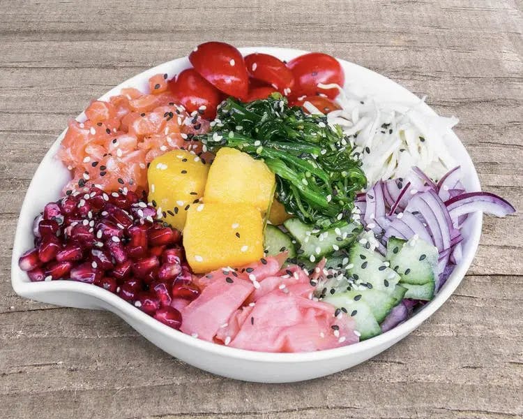
Include also, seasonable items. It would not make sense to a viewer to have a plate of vegetables that grow in seasons opposite each other (such as winter squash and cucumber). If the diversity in an image is forced to the point where it confuses the viewer, no amount of color psychology can bring the message back to the forefront.
And don’t forget the complementary colors in your arrangement! Viewers will be reminded of the phrase “eat the rainbow” if the foods in the image are both colorful and kept in the same season and will be more inclined to do just that.
9. Retouch when necessary
Professional food photographers don’t use filters for their photos but they can always retouch them. If you’re starting a food photography business, you should learn when you should retouch your photos and when to leave them alone.
In a study completed by the University of Michigan, researchers found that filtering or retouching photos can increase engagement. However, it depends primarily on the subject being photographed.
In the study, they found that retouched landscape photos were not engaged with nearly as much as retouched photos of food. As a professional food photographer, your goal is to help your clients increase their business and if you want to do that you may want to consider retouching your photographs.
In fact, retouched food photography had a 90 percent increase in engagement over unretouched photographs of food. This means that if your goal is to help your clients’ food business grow, you need to consider retouching when necessary.
When used in combination with the other elements we’ve talked about so far, filters can only continue to improve the reach of your food photography. One of the ways we can illustrate this is by looking at how filtering images of foods of certain colors can boost the vibrancy of the food in subtle ways.
You can easily try this by taking a photograph of a ripe red strawberry and increasing the highlight with a red filter color and the shadow with a green filter color. This will not only utilize the complementary color concept but will also manipulate the photo so that the strawberry appears to be juicier and riper than it is.
10. Assume your viewer is right-handed
The goal of food photography is to entice the viewer to eat the food or drink the beverage that you are photographing. As most people are right-handed, this means that you should orient your food photography so that it looks like a right-handed person was eating or drinking it.
In a study conducted in 2020, researchers found that viewers were more likely to envision themselves drinking a cup of coffee when the handle of the cup was oriented in a right-handed position against the background.
If you want your food photography to be successful you need to take photos that make people want to eat or drink the item presented. One way to do this is to make sure that when you use utensils as props or have other props that need to be handled a certain way that you set them up so that a right-handed person can use them.
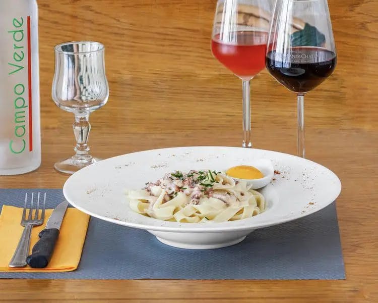
For example, if you place a fork in a picture. You want to make sure that it is on the right side of the food. This way the majority of people looking at your photograph will be able to see themselves taking a bite of the food with that fork. This tip will help you to create pictures that convert viewers into customers and will help you to get more repeat food photography customers.
Start with correct lighting, compose your scene with props, people, or simply the food on its own, and get to arranging those vital complementary colors to create the most visually striking scene. Whether you focus on creating a moody image through manipulating lighting, or simply updating existing materials with bolder complementary color choices, keeping in mind the science behind the psychological impacts of color will aid you in achieving your goals.
If you’re looking to start a rewarding career in food photography, consider working with OCUS. They can help you to find more job opportunities at better rates.
The Best Food Photography Tips Backed By Science Infographic